Unique “About”-Pages
A great way to distinguish yourself from the crowd is to have a truly unique about page.
Dustin Curtis has taken a truly unique approach to the about page. What he has created is a death clock of sorts; a timeline of his life up until now and to beyond. It’s an about page that truly speaks to the designer’s capabilities and creativity. It accomplishes the most important thing about a website and a great about page - it’s something you won’t soon forget.

While the content is slight, the “Floating Asian Kid” gag below is cute. Move your mouse around the graphic to see why. It is both memorable and unique

Quomo has taken a very unique approach to the about page - a series of full-body action shots on a horizontal carousel.

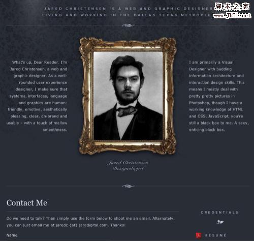
Jared has taken a very clever approach to the self portrait (quite literally).
Mark has put his face on Mount Rushmore.

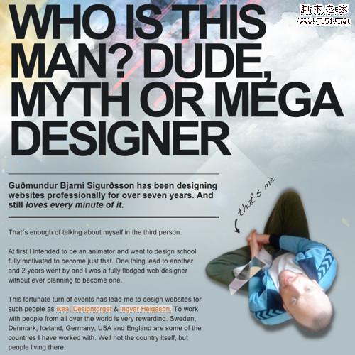
Guðmundur has used big typography and an interesting perspective for his portrait.
 Big Photograph
A large photograph of yourself can leave a lasting impression in your users minds if it’s done well.
The more we use computers to communicate, the less face-to-face interaction we get. This is why David DeSandro’s about page is so effective. His headshot is as big as any I’ve seen on an about page makes you really feel as thought you’re meeting a real person rather than some web designer on some website. Once the introduction is made, you can easily connect up with David via his social networking presence or the handy contact form below his picture. It’s worth noting his about page is well organized as well.

Janis’ about page is short on copy but big on artistic design. You get a good impression in short order.

Subtraction.com, in addition to being one of the coolest domain names ever, is a picture perfect study in minimalism. Khoi chose an incredible picture for his about page and organized his biography into an easily digested format. It doesn’t hurt that he threw his adorable black lab in there for good measure.

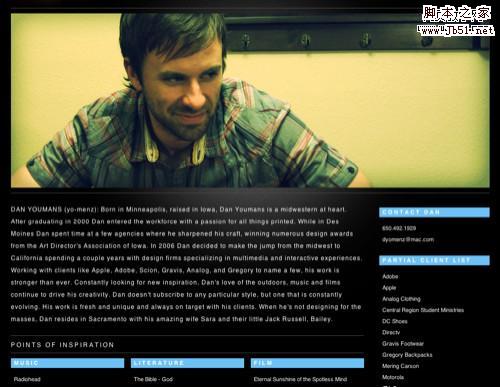
Aside from having an incredibly awesome domain name (unstoppablerobotninja.com), Ethan has a great about page too.

上一页12 3 4 5 6 下一页 阅读全文
A great way to distinguish yourself from the crowd is to have a truly unique about page.
Dustin Curtis has taken a truly unique approach to the about page. What he has created is a death clock of sorts; a timeline of his life up until now and to beyond. It’s an about page that truly speaks to the designer’s capabilities and creativity. It accomplishes the most important thing about a website and a great about page - it’s something you won’t soon forget.

While the content is slight, the “Floating Asian Kid” gag below is cute. Move your mouse around the graphic to see why. It is both memorable and unique

Quomo has taken a very unique approach to the about page - a series of full-body action shots on a horizontal carousel.

Jared has taken a very clever approach to the self portrait (quite literally).

Mark has put his face on Mount Rushmore.

Guðmundur has used big typography and an interesting perspective for his portrait.
 Big Photograph
 A large photograph of yourself can leave a lasting impression in your users minds if it’s done well.
The more we use computers to communicate, the less face-to-face interaction we get. This is why David DeSandro’s about page is so effective. His headshot is as big as any I’ve seen on an about page makes you really feel as thought you’re meeting a real person rather than some web designer on some website. Once the introduction is made, you can easily connect up with David via his social networking presence or the handy contact form below his picture. It’s worth noting his about page is well organized as well.

Janis’ about page is short on copy but big on artistic design. You get a good impression in short order.

Subtraction.com, in addition to being one of the coolest domain names ever, is a picture perfect study in minimalism. Khoi chose an incredible picture for his about page and organized his biography into an easily digested format. It doesn’t hurt that he threw his adorable black lab in there for good measure.


Aside from having an incredibly awesome domain name (unstoppablerobotninja.com), Ethan has a great about page too.

上一页12 3 4 5 6 下一页 阅读全文
标签:
关于我们,网页设计
免责声明:本站文章均来自网站采集或用户投稿,网站不提供任何软件下载或自行开发的软件!
如有用户或公司发现本站内容信息存在侵权行为,请邮件告知! 858582#qq.com
暂无“有创意的关于我们网页页面设计”评论...
P70系列延期,华为新旗舰将在下月发布
3月20日消息,近期博主@数码闲聊站 透露,原定三月份发布的华为新旗舰P70系列延期发布,预计4月份上市。
而博主@定焦数码 爆料,华为的P70系列在定位上已经超过了Mate60,成为了重要的旗舰系列之一。它肩负着重返影像领域顶尖的使命。那么这次P70会带来哪些令人惊艳的创新呢?
根据目前爆料的消息来看,华为P70系列将推出三个版本,其中P70和P70 Pro采用了三角形的摄像头模组设计,而P70 Art则采用了与上一代P60 Art相似的不规则形状设计。这样的外观是否好看见仁见智,但辨识度绝对拉满。
更新动态
2026年01月01日
2026年01月01日
- 小骆驼-《草原狼2(蓝光CD)》[原抓WAV+CUE]
- 群星《欢迎来到我身边 电影原声专辑》[320K/MP3][105.02MB]
- 群星《欢迎来到我身边 电影原声专辑》[FLAC/分轨][480.9MB]
- 雷婷《梦里蓝天HQⅡ》 2023头版限量编号低速原抓[WAV+CUE][463M]
- 群星《2024好听新歌42》AI调整音效【WAV分轨】
- 王思雨-《思念陪着鸿雁飞》WAV
- 王思雨《喜马拉雅HQ》头版限量编号[WAV+CUE]
- 李健《无时无刻》[WAV+CUE][590M]
- 陈奕迅《酝酿》[WAV分轨][502M]
- 卓依婷《化蝶》2CD[WAV+CUE][1.1G]
- 群星《吉他王(黑胶CD)》[WAV+CUE]
- 齐秦《穿乐(穿越)》[WAV+CUE]
- 发烧珍品《数位CD音响测试-动向效果(九)》【WAV+CUE】
- 邝美云《邝美云精装歌集》[DSF][1.6G]
- 吕方《爱一回伤一回》[WAV+CUE][454M]
